Finance Forest
Daniel Bismire
13 Week Project in 2019, conducted during the Interaction Design Studio at the University of Sydney in conjuction with my team Dylan and Charlotte. This assignment obtained a High Distinction
This report will demonstrate our design process including iterations, testing and how we came to our final solution.
Finance Forest is our solution to issues made clear by primary and secondary research, such as addressing the lack of engaging financial education in primary schools, and exploring how to facilitate financial learning and understanding of value when our society is becomining increasingly cashless.
Our solution is the form of a tablet application, which is used by educators in the school system as an aid in teaching financial concepts. The application will help children understand financial concepts and subsequently build beneficial monetary habits from a young age, which will assist them in the long term.
My Role
Initial Research
My individual research was to investigate how children perceive money and how it affects their attitudes towards the value of money. Specifically looking into the interactions between parents and their children. From there I gathered my findings from Contextual Interviews, Observations and Archival Research. From there I created five insights.
We then came to together and combined our findings into three main research insights:
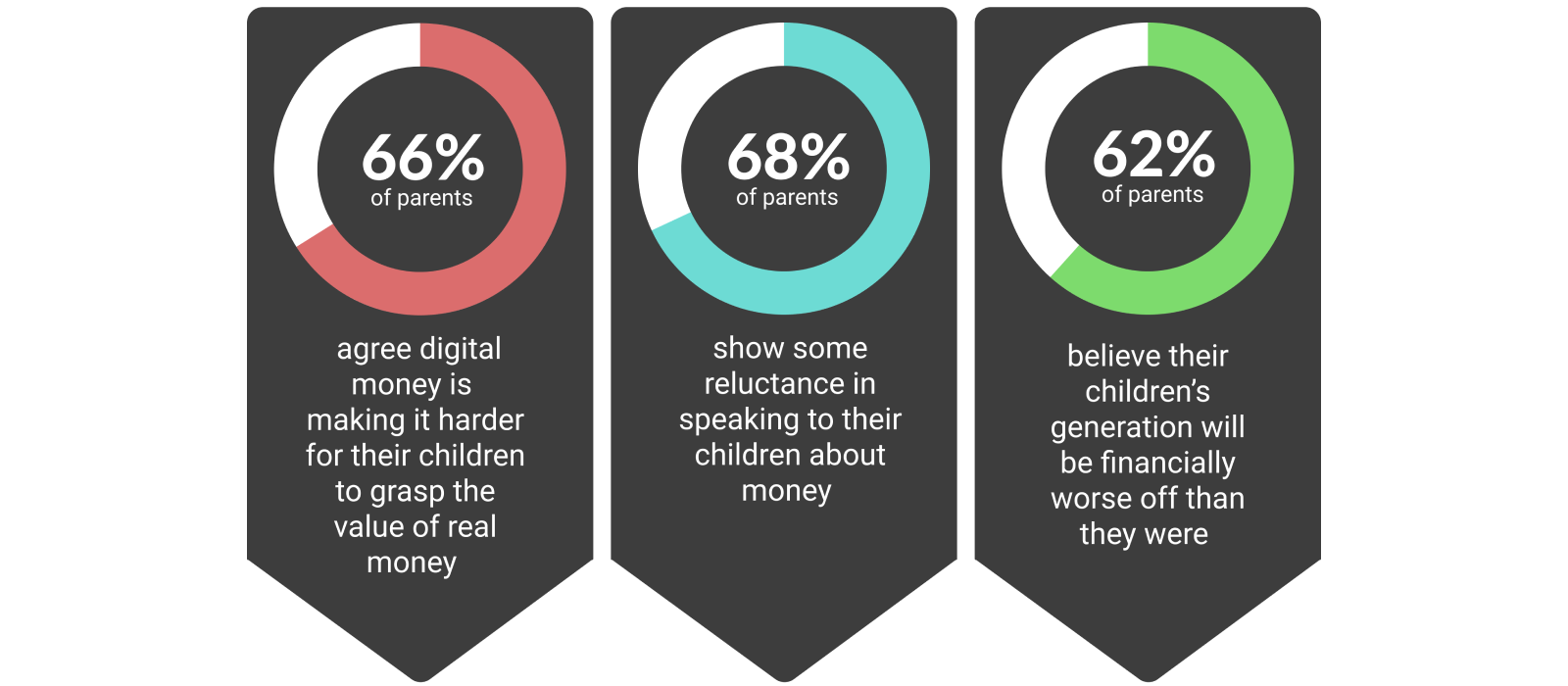
An overwhelming theme in our research is that children need to learn about different forms of currency at a young age in an interactive and engaging way, in order to have a healthy relationship with money.
THE PROBLEM: DEFINED
The problem we are trying to alleviate is children's warped perception of monetary value. Through our research, we found that this can be characterised in two ways. The lack of tangibility of money as we move into a cashless society, and the lack of engagement when learning about financial concepts.
The tangibility of money is disappearing. This is expected as we become more digitally focused society. Through this transition however, we leave behind parts of the analogue world that were useful in their own ways, such as the physicality of money. Prior to emerging digital technologies, people could learn about money with greater levels of context as they could physically hold, count and save notes and coins. But as these small coins and notes turn into numbers on a screen, it becomes harder to see how these numbers relate to the world and what they mean for today's children. Although children receive pocket money in the form of tangible money, there are more and more options available to parents and children, such as Spriggy and Dollarmites.
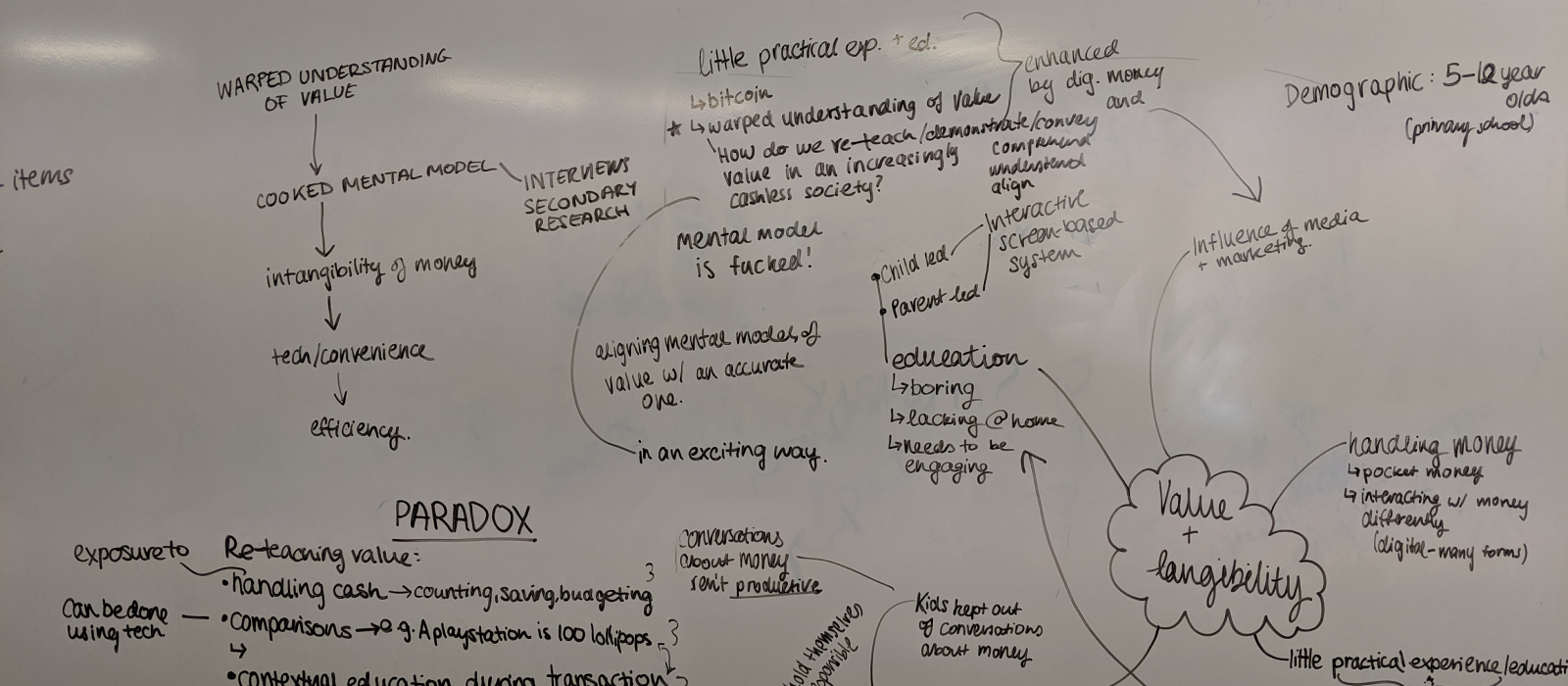
The second key factor affecting children's financial literacy is the low level of engagement in classrooms. We found that children’s financial education in schools is just simply not engaging enough, if it even does occur at all. Out of 14 primary school children interviewed, only 6 could recall any single thing they had learnt in school about money. During the interview process, we found that some children were given access to play money within classrooms, yet, as is demonstrated in task 1, most children had a low understanding of monetary value.
To quote Dorst's Frame Innovation, we can describe this problem as being 'open, complex, dynamic and networked' (2015). It is not solvable in the sense that it can be fixed and forgotten, but rather only alleviated and assisted. Through this frame, we aim to do the best we can in designing a solution that can help in realigning children's perceptions of money with its true value.
Early Concepts
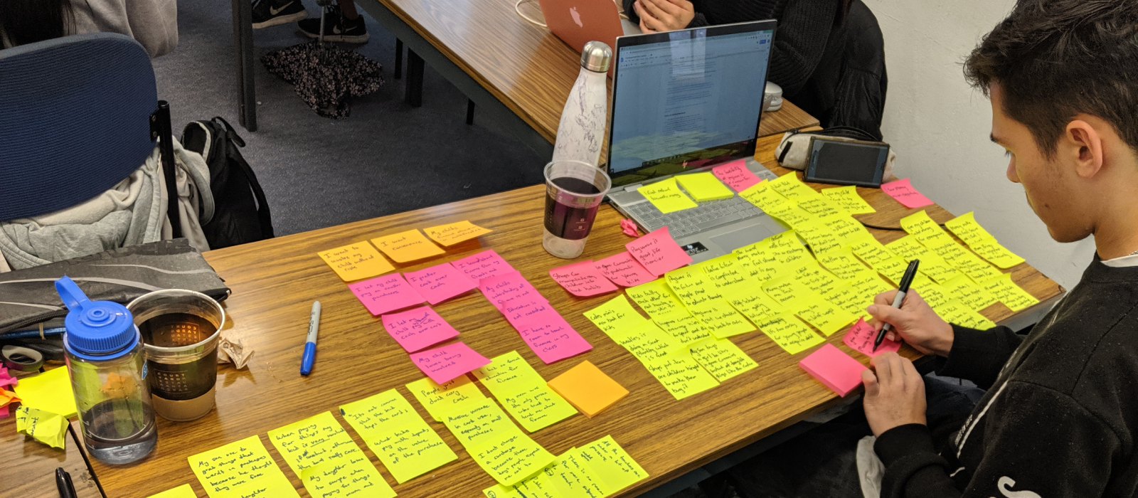
We used our insights to help design three solutions over several days utilising a variety of repeating methods, including:
Group Passing
Generating quick ideas and passing one idea to another to add to each idea.
Crazy 8
Generating 8 quick ideas through sketching.
Brain Writing
Building on each others ideas on a whiteboard.
MY TREASURE
Our first concept was "My Treasure", which utilises augmented reality through a phone or tablet to visually convey how much money a child has. Currently, there is no way for children to understand how much money they have in their savings in terms of a visual depiction that they can comprehend. By visualising children’s savings, they can gain an accurate perception of monetary value.
PENNY PAINTER
Our second concept was called "Penny Painter." This concept is limited to children under 13, and teaches them about the transaction process, buying, selling, and value. Using a tablet, children draw inside the canvas to create an artwork. Each child begins with a basic kit of digital painting tools. Once their artwork is complete they can put it up for auction, where other children can place bids on it using play money which resembles real currency. This process allows children to earn play money, which can be used to buy more digital art supplies.
FINANCE FOREST
Originally, Finance Forest was a teacher led program suited to the classroom. Students in the class are given access to a tablet or computer which displays daily challenges assigned by the teacher.
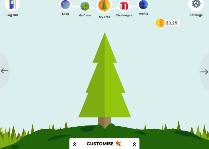
Each child could see their tree on the home page, and it's growth represents the child's progress. Skills are taught in the form of lessons that the child must complete to continue growing their tree. Each student also has their own profile, which displays their name, photo, number of lessons learnt, and stats, which are compared to other people in the classroom. Each student has access to a chart which demonstrates the class average growth, top growth, lowest growth, and the student’s individual growth, demonstrated using tree rings.
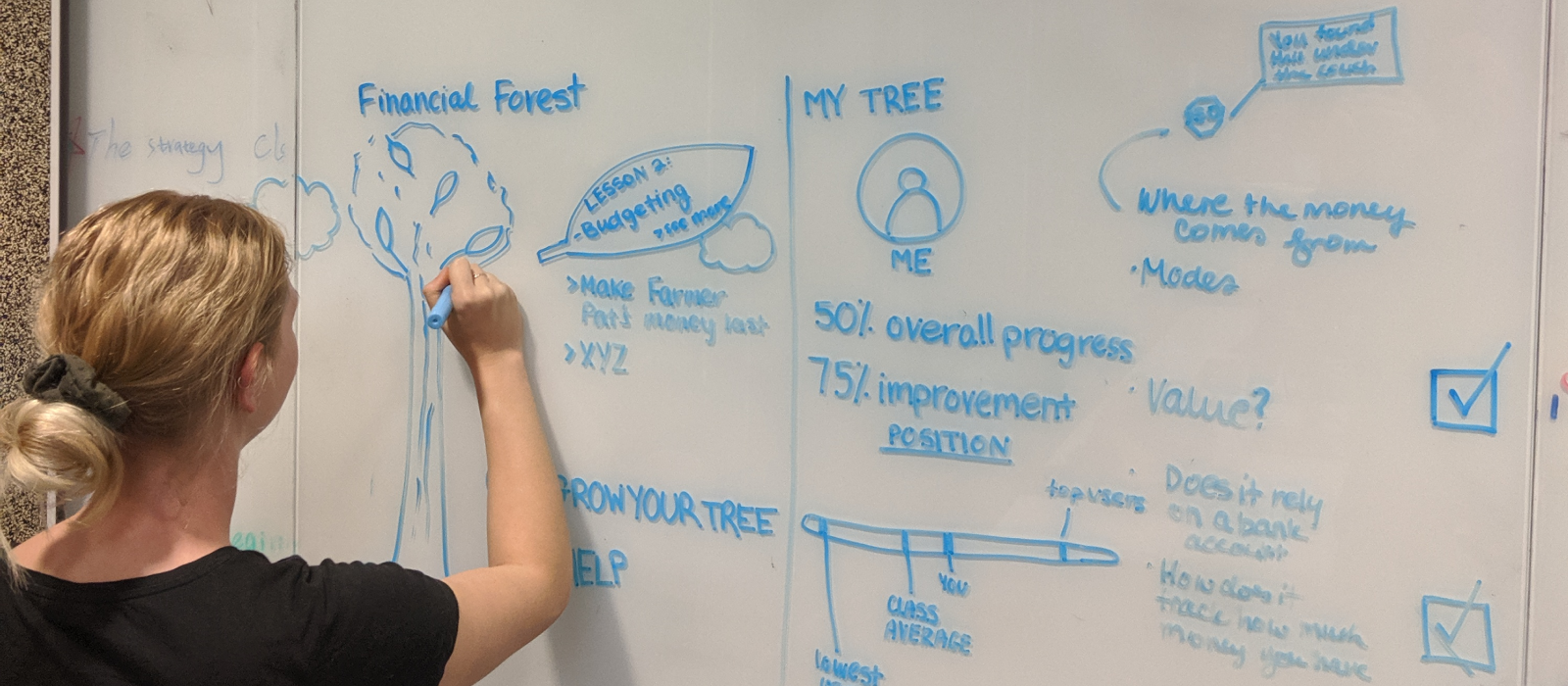
This concept was initially very strong, as it helps to solve our core problem by re-teaching value to children through challenges to encourage friendly competition in an interactive and engaging way. It would teach children about the transactional process and give a way of visualising their progress.
There were some drawbacks to this concept however, as children could use their progress or a classmate's lack of progress to cause conflict. We also have to think of ways to make the application as engaging as possible, so that children would be excited to log on, as opposed to their traditional financial education.
MOVING FORWARD
We chose to proceed with Finance Forest as it fulfilled our criteria for success more than the other concepts. Our criteria for success was that the product must:
Be interactive and engaging Re-align children’s understanding of the value of money effectively. Be understandable for primary school aged children and draw on an appropriate mental model. Require no pre-requisite or assumed knowledge.
Finance Forest addresses all of these criteria. It is interactive and engaging as lessons are in the form of games and challenges. Children are incentivised to continue with lessons to beat their peers through friendly competition. The use of additional extras along the way, such as the shop, keeps the game interesting and dynamic, and adds an element of customisability. Finance Forest’s high level of engagement solves one of our main issues identified through user research, which was that children aren’t finding current financial education engaging enough, meaning that they fail to retain information.
Finance Forest also effectively teaches monetary value to children through the lessons, which are unlimited in scope and difficulty, making the platform extremely versatile and adaptable. Each week has a new concept, and children can revisit lessons at any time. Although ‘My Treasure’ taught monetary value very well by visualising savings, it could remain stagnant for periods of time, and therefore fails to be consistently engaging.
In addition, Finance Forest is easily understood by children, and uses themes and symbols familiar to them to introduce new concepts. For example, the motif of the tree to represent the growth of knowledge is very familiar to children, and is therefore an appropriate tool to introduce new concepts. Alternatively, Penny Painter failed in this regard, as the new concept of auctioning and transaction increasing children's cognitive load as it is unfamiliar.
Seeing as Finance Forest begins when the child starts school and is a government initiative, there is no pre-requisite or assumed knowledge required to use it. Each child moves at the same pace, and there is opportunity to revise prior lessons. If a child is falling behind, this can be viewed by their teacher and they can be given extra help, without needing to draw attention to themselves.
THE PROCESS
BUILDING THE FOUNDATIONS: EARLY DESIGNS AND LOW-FIDELITY TESTING
FLOW DIAGRAM AND WIREFLOW
As a group we needed to understand the steps the user would take to navigate between pages. We mapped out each section and their associated links, to create a flow diagram. From there we eliminated and added sections as necessary.
Finance Forest begins with the user logging in and completing the lesson of the day. After completion the user would then be able to use the other features of the application. The home screen is where the user can access all of the features within Finance Forest. This includes tree maintenance, nursery (to buy items), customise, profile, & settings, tree forest, progress and lessons.
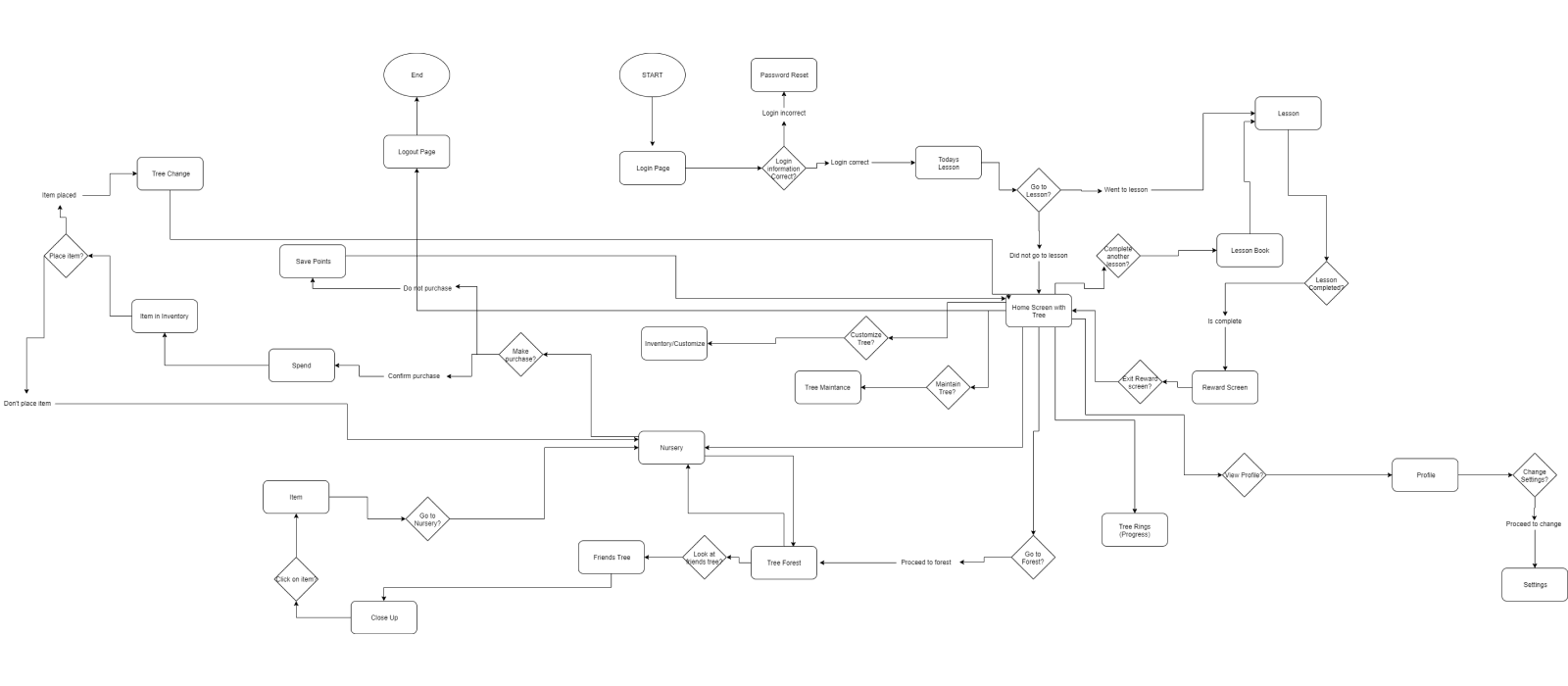
From gathering feedback we found that users were confused about the “lessons start” page, thinking that this was the home page as it appeared first when they logged in. We addressed this by allowing the user to freely explore the app, rather than be forced into completing the lesson.
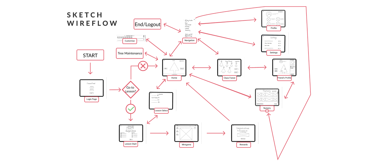
Navigation within Finance Forest was initially in the form of a burger menu which is accessible from any page. We included on screen navigation in the form of arrows that allow the user to swipe between pages. As seen in the wireflow, users can visit their friends profile where they can select items on their friends tree and buy it from the nursery.
A customization menu is implemented on the home screen, which can be accessed via a swipe or click gesture. When the menu is open, users will be able to drag and drop items on to the tree. There is also a 'tree maintenance' section in the wireflow, however we decided to get rid of this feature early on as it didn't relate to our criteria for success.
Paper Prototyping
Paper Prototypes were used early on in the design process to identify any usability issues, particularly to do with navigation. By conducting user testing with low fidelity paper prototypes, we were able to understand how intuitive the app was to use, and could make appropriate changes quickly and easily for the next round of testing. In order to test every interaction within the app according to user needs established through prior research in task 1, users were given 3 overarching abstract tasks each with concrete tasks within these categories.
The task were:
Abstract 1: I want my learning to be social. Concrete 1: Navigate to the class forest and click on someone’s tree.
Abstract 2: I want positive reinforcement and to know I’m on the right track. Concrete 1: Complete a lesson to get to the rewards page.
Concrete 2: After completing a lesson, notice how your tree grows and you earn more money. Go to the nursery to buy an item with this new money, and add it to your tree.
Abstract 3: I want to feel in control of my learning. Concrete 1: Choose a challenge to complete.
Concrete 2: Change to colour-blind mode from the settings page.
These tasks were tested with 8 users, all of whom were either still in high school or have graduated within the past five years. It was important that these users were older as opposed to our target user group of primary school aged children, as the prototype would not have been well received or understood by this group.
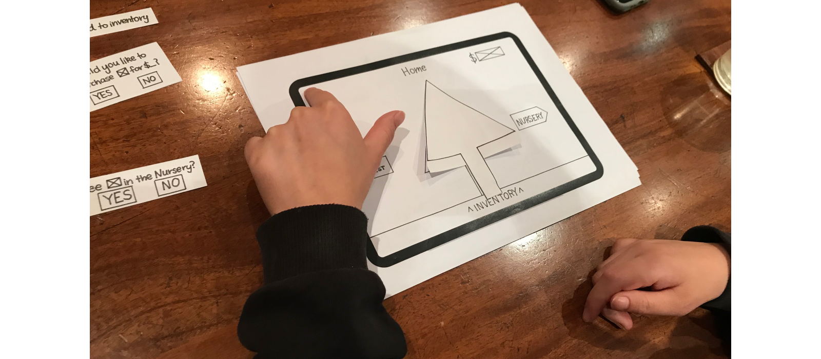
The think aloud method and contextual observations were used to understand the thought processes behind a user’s action, and identify when they made errors and why.
- Task
- Time it took to complete
- Contextual observations
- Errors
- User Comments.
Users were also asked post-test interview questions to encourage reflection and gauge their overall opinions of the app in its early stages.
- Did you find it easy to navigate? Where there any moments where you felt lost or not sure what to do?
- What did you think about the name?
- Do you think this will be easily understood by primary school aged children?
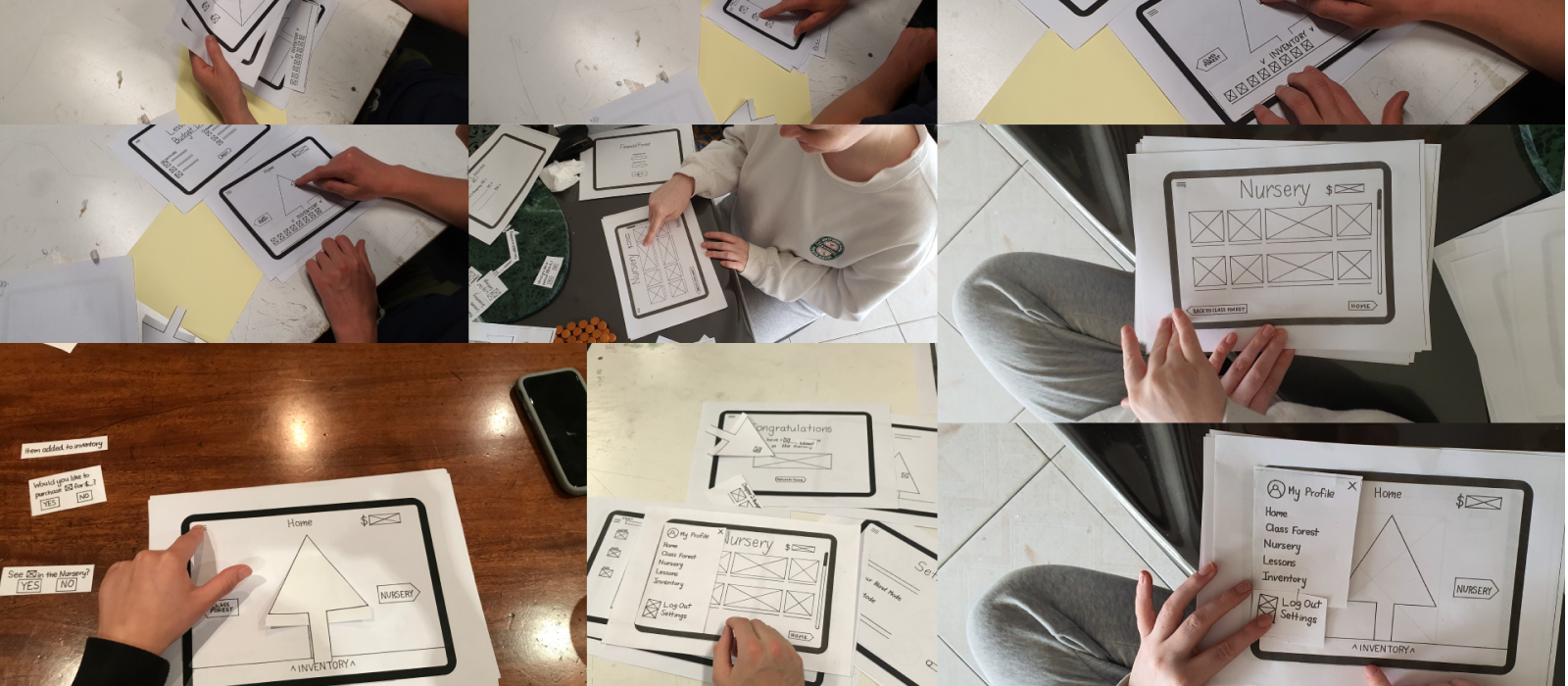
Low Fidelity Insights
Users thought that the word ‘lessons’ could discourage children from enjoying the game, as they would associate this with school and learning. We wanted to avoid this and make the app as close to a game as possible, so we changed ‘lessons’ to ‘challenges’. Additionally, some users suggested alternative names for ‘inventory’, so we changed this to a chest/treasure chest to gamify it further and make it recognisable for younger users. Additionally, one user commented that words like “objectives” and “outcomes” at the beginning of each lesson are irrelevant for children, and should be changed to something similar to “your task” or “how to”.
Lesson restriction: Initially, users had to complete the lesson of the day before they could access any other part of the app, and they could not exit out of it until the lesson was completed. We decided to change this based on user feedback, as users thought that children could resent their learning if they were forced to do the lesson before accessing other elements.
Navigation: The navigation underwent significant changes, as some users found it tiresome to go back through the hamburger menu to reach a specific page, and some necessary interactions weren’t as visually accessible via the hamburger menu. An interesting observation was that half the users navigated with the on-screen arrows and the other half used the burger menu. As a result, we changed to a sticky navigation bar which clearly displays each screen as a display for the next iteration. Additionally, users tended to not notice the on screen arrow buttons which acted as a secondary navigation tool. We therefore changed the swiping navigation to adhere to app conventions by placing two semi circles on each side of the screen.
The process of creating paper prototypes and gaining feedback on them proved to be extremely valuable in making changes to Finance Forest. Some actions, such as swiping and using the arrow buttons were not as intuitive as once thought, and required significant alterations to make the navigation appropriate for young first-time users. With these insights in mind, we digitised the paper prototype and created a mid-fidelity prototype.
MAKING CHANGES
MID-FIDELITY TESTING
Moving forwards from our initial prototyping we moved into the digital realm. Here we made the changes mentioned above, overhauling our navigation, choice of words, and the way in which our lessons were delivered.
We used Figma for our prototyping, which enabled us to make rapid changes as a group and see how it would look on a tablet display. We planned for our next round of user testing to be with older children in primrary school (8 years old and up), and so creating mid-fidelity digital prototypes was the next logical step, as children would be more likely to understand how to use it.
We ran our first round of user testing with this sector of the target user group by carrying out interviews, using the think-aloud method and making contextual observations. The feedback we gained was very valuable, as our users were able to provide valuable insight into what they did or didn't understand. We were then able to translate this feedback into insights.
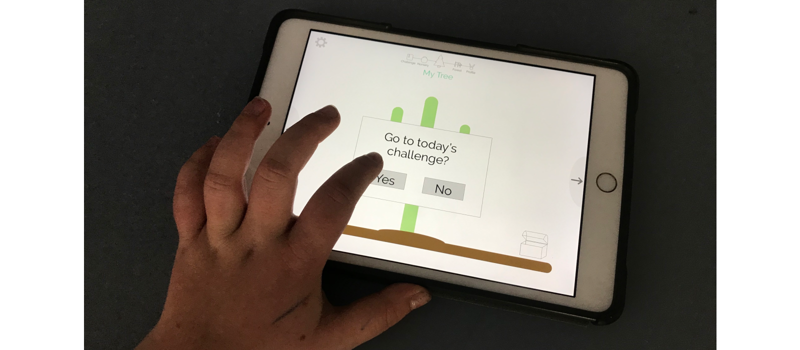
MID-FIDELITY INSIGHTS
From our testing with learned of a myriad of issues which had overlooked. The two biggest was our customisation system and our swipe navigation.
For the customisation, we originally represented this by a chest on the bottom right of the screen. Users could tap on it and then choose between changing their tree, or customising their existing tree with items. We found that users became confused - many tried swiping the box, rather than just tapping. And the extra decision to customise or change the tree within the box was making adding confusion.
We decided to build a swipe-up system instead, where users can swipe up from the bottom of the screen to access the menu. We used tabs identical to those already within Finance Forest to allow for consistency.
The other major problem we found was that none of our users used our swiping navigation intuitively. Our users said that if they knew that swiping was there they would have used it, but they just didn’t think to try. Wanting to improve our design, we decided to conduct secondary research into swiping conventions in already existing applications.
One resource we found helpful was Google’s Material Design website. This resource provided examples of ways to improve the user’s experience through design. Through the Google Material Design website, we found a large compilation of swipe animations. Browsing through this compilation, our team began to notice similarities between all swipe gesture designs.
The first is the use of dots or bars as an indicator for where the user is, and how far they can go with swiping. As you can see in the picture below, the dots give the user a sense of exactly where they are, and shows the other options available to them. Our top navigation bar acts as a tool to orientate the user by always showing which page they are on and where they can go.

The other indicator we noticed is how many apps show a preview of what is on the next screen. The screenshot above demonstrates this by hinting at the content of pages through iconography. We have incorporated this into our top navigation bar in the high fidelity prototype, although because our application is on a larger device and scale, we decided to make our icons more detailed whilst still giving an indication about page content.
The last element we noticed was that many applications didn’t provide any swiping indicators at all, and decided to let the user figure it out for themselves. This also could be an option for Finance Forest, especially because kids are curious by nature, but conversely first time users will require guidance. At this point we came together as a group to make changes for the high fidelity prototype.
IT’S ALL IN THE DETAILS: HIGH-FIDELITY TESTING AND FINAL CHANGES
The High Fidelity Prototype was guided by insights from paper prototyping and mid fidelity prototyping, to ensure that the app was as refined and usable as possible. At this stage, we were confident in user testing with the youngest participants within our target demographic of primary school aged children. By gradually testing younger participants, we were able to gauge their level of understanding and exposure to digital apps, and make changes accordingly. Using the prototyping tool Figma, our team was able to collaboratively develop Finance Forest.
HIGH-FIDELITY TESTING
We user tested 6 of the youngest members of our target demographic, which was an insightful and challenging process. Similarly to other rounds of user testing, we gave children concrete tasks within abstract frameworks, however we phrased these tasks as a narrative to make it more appealing and easier to follow for young children.
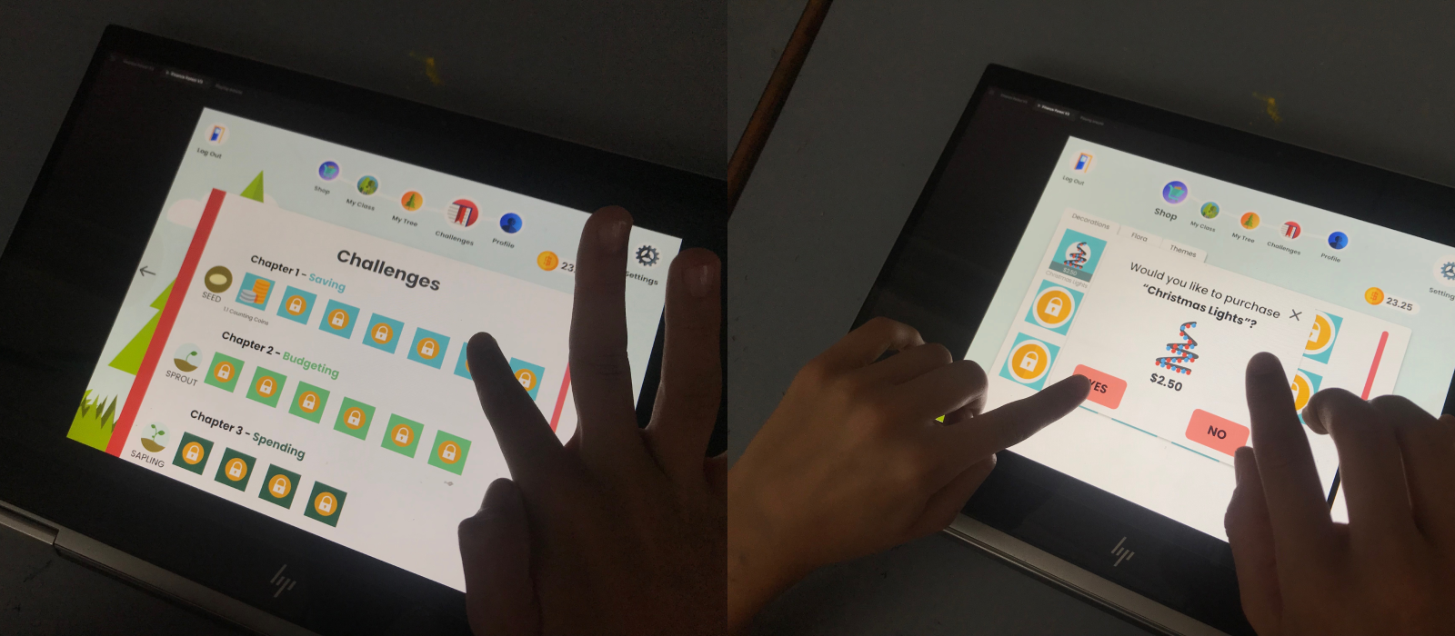
By phrasing tasks as a narrative, children were more invested and engaged in the process. We conducted a contextual observation and asked children to ‘think aloud’ whilst completing the tasks. The results from user testing were again tabulated as was done with paper prototyping and mid fidelity prototyping.
Children were also asked follow up interview questions:
- Was there anytime you found it difficult to use and navigate?
- What changes would you make?
- What do you think about seeing your progress rings on your profile?
- What do you think the word flora means?
- Do you think you would like to use something like this in your maths classes?
- Did you know you could swipe between pages? Do you think you would be more likely to swipe between screens or use the top navigation bar, or both? Why?
- What do you think seed, sprout and sapling mean?
HIGH FIDELITY WIREFLOW
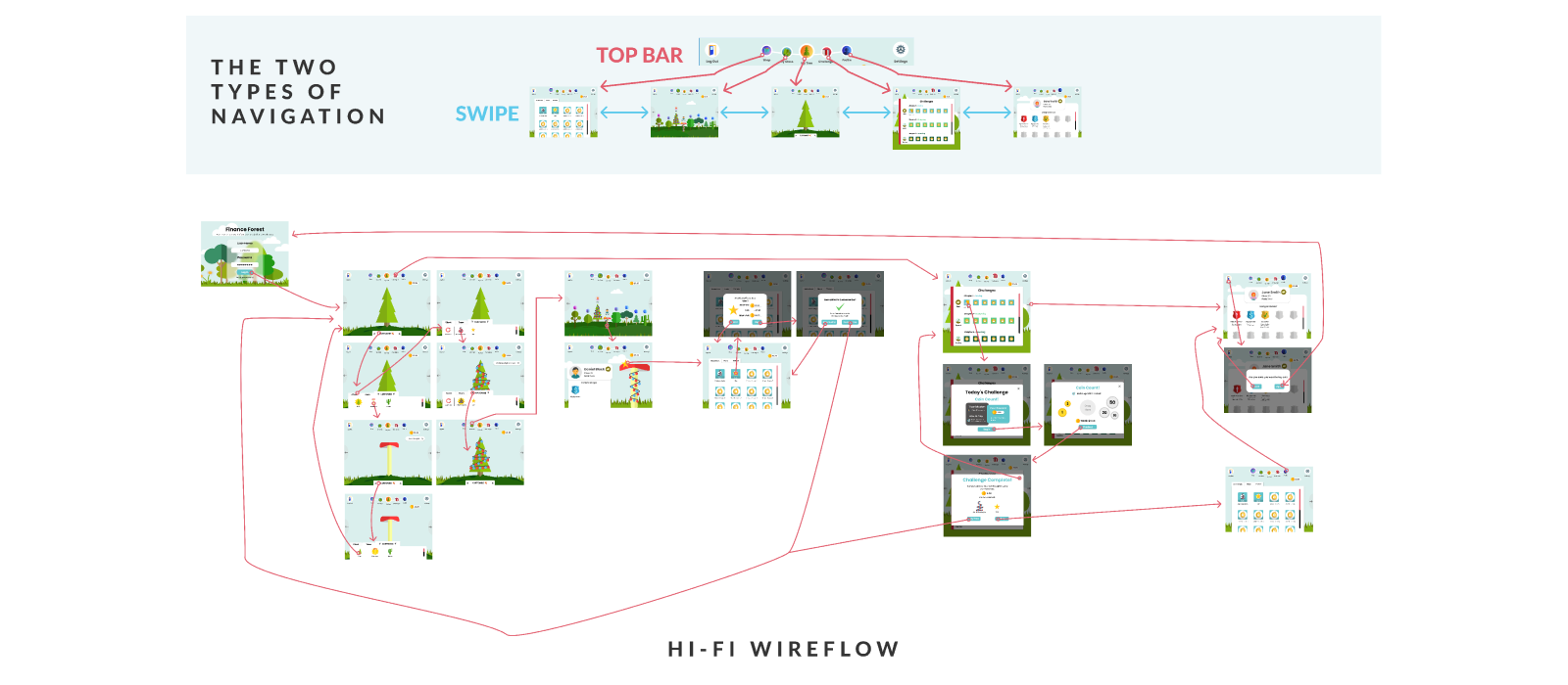
After thorough user testing, we overhauled the navigation once more. As seen in the wireflow, we created two ways to navigate - through the top navigation bar, and by swiping. From our research, we found that children responded positively to having two navigation options, as they felt they had greater control and freedom.
The wireflow has been split to demonstrate for readability. The first part is the two forms of navigation and the second part is the wireflow of the application.
In the wireflow, customise is a swipe up feature that will allow users to access their chest and tree options, including a reset button for any errors. There are also links to pages when finishing an action. An example of this is that when the user purchases an item they have the option to return to shop or proceed to their tree.
HIGH-FIDELITY INSIGHTS
Our final round of user testing provided the following insights which informed the final iterations:
Iconography, labelling and language: This round of user testing stressed the importance of using icons for each labelled element, which is especially important for the app to be intuitive to use for young children. For example, our youngest participant who was 6 years old knew what the word ‘customise’ meant, but couldn’t recognise the written word on the screen. An iteration we made based off this feedback was including the paintbrush icon next to the customise bar on the ‘My Tree’ page. We found that no children had trouble logging in or out, and we can attribute this to adequate labelling and use of icons, as well as from children's prior experience using devices. Some younger children didn’t know the word ‘flora’ within the shop, and this was changed in the final version.
Navigation: The top navigation bar was very well received, and was the primary navigation tool for most participants. All 6 users initially didn’t realise that they could swipe between screens as a secondary navigation tool, despite the arrows on either side of the screen, yet all of them agreed that they would like to use it once they knew it was there. Interestingly, one participant was initially only using the top navigation bar, and organically discovered she could swipe between screens by accident. From that point onwards, she used a combination of swiping and the navigation bar to get to different pages. In the follow up questions , this participant said that she would use a combination of swiping and tapping to navigate, and couldn’t articulate why she didn’t see the swiping arrows initially. She also thought that it would be easy to ‘accidentally’ swipe between screens, and for that reason they wouldn’t need to be made more obvious.
Profile: There are several types of incentives to complete challenges within Finance Forest, these are monetary (earning coins) and non monetary (unlocking items in the shop and the ranking system). Another non-monetary incentive was the progress rings within each child’s profile, which is also visible for friends within the Class Forest. Four participants could identify that the progress rings were a visualisation of the completion of different tasks, yet most agreed they wouldn’t care about knowing their progress in terms of numbers and percentages. For this reason, we decided to change the profile to display an alternative incentive. In the final version of Finance Forest, this has changed to badges, which display goals the user must reach to earn a badge.
Ultimately, our final round of user testing proved to be very insightful, and allowed us to make minor changes to Finance Forest which made a big difference to it’s ease of use. We paid close attention to the dexterity of children, and made sure elements weren’t too close together. Children received the app well, and all children said they would like to use it in a classroom environment.
THE SOLUTION
OUR DESIGN
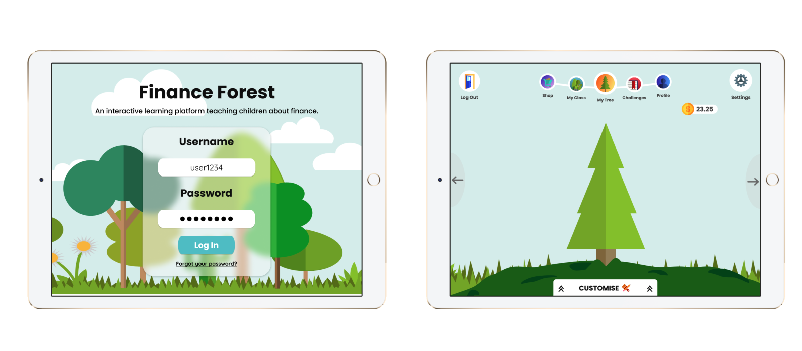
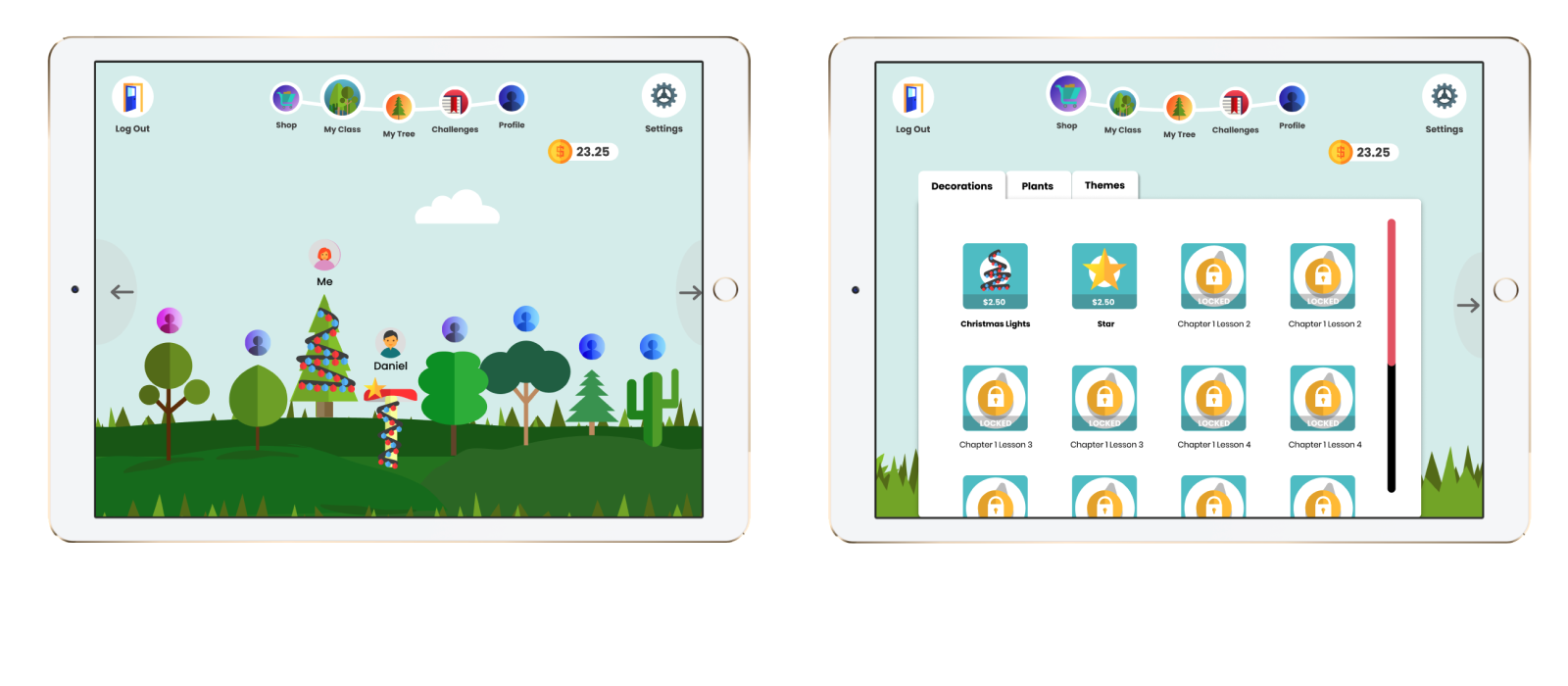
The final design is an interactive learning companion that utilises gamification to help children understand financial concepts by bridging the gap between perceptions of physical and digital money. Our design process has been user centric from the beginning, and this is demonstrated through our final application which has undergone several iterations. Children can move freely between pages, and learn at their own pace, with (play) monetary and non-monetary incentives to encourage them.
Additionally, the social element of Finance Forest keeps the application interesting and dynamic, and encourages healthy competition between peers. Smaller details such as the price breakdown when making a purchase subtly makes monetary value more familiar to children. Ultimately, Finance Forest has the potential to make a significant difference in the lives of children growing up in the digital age by encouraging a positive long lasting relationship with money.
Final Screens
INTERACTIVE PROTOTYPE
Video Pitch
Video Walkthrough
Next Steps

We aim to add more features and customisation to make the application even more engaging. This will include timed in-game events, a tree maintenance mini game to earn extra money, and the possibility for users to unlock accessories to customise their avatars.
When it becomes time for implementation, partnering with the federal government would be ideal and most likely necessary to be rolled out across schools.
After establishing ourselves within the primary school system, we could then develop a version for high school students, making sure the content is stimulating and information is given in bite-sized chunks. We would likely expand the application to mobiles as highschools are often more crowded and less inclined to use iPads.
Eventually if our successes continue, we want to spread Finance Forest globally, venturing into schools all around the world. This would be a large undertaking as other countries have varied expectations of education, and we would have to be considerate of cultural differences. Ideally we will be able to assist children, teenagers and young adults in forming excellent monetary habits all across the world.
Once we begin to commercialise, we will have to consider the stakeholders affected by Finance Forest. An impact of having a program dedicated to financial literacy means that the schools limited curriculum will have to change to accomodate it. Teachers and students will have to adapt to the new program, potentially losing time from other subjects.
The potential positives of teaching children financial literacy will far outweigh the negatives. Being in control of your finances can be life changing.A high level of financial literacy can even boost the economy, in Australia, and globally. As users make better decisions and avoid the burden of debt, an economy with more jobs and opportunities is inevitable (Damayanti et. al. 2018).
