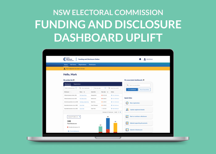
NSW Electoral Commission Dashboard Uplift
Daniel Bismire
4 week project conducted by myself during 2022, as a consultant for the NSW EC.
Brief
Create a dashboard uplift for the NSW Electoral Commission Funding and Disclosure online portal. This will be the new standard across the product and improve the user experience.
Time: 3 weeks for designs and final approval before build starts.
Research: Journal Articles, Web Pages, Government dashboards.
Participants: 6 Users for several tests on the dashboards.
Synthesis: Affinity Diagram
Deliverable: 2 dashboards, a political participant landing a page and a User landing page. Including all variations of those dashboards.
My Role
Tools Used
This report will demonstrate my work creating a dashboard experience on the NSW Electoral Commision. Through discovering, defining, developing and delivering, we were able to create an optimal experience for the user. I was assigned as lead designer on this project with my consultancy company to digitise many long registration forms and build a dashboard.
I was assisted by a development team, Business Analyst and a testing team. Together we implemented best design practices including a progress stepper and accessibility functions onto the portal.
Example 1: Party Agent registration form, one of the many forms to be digitalised.

The Dashboard
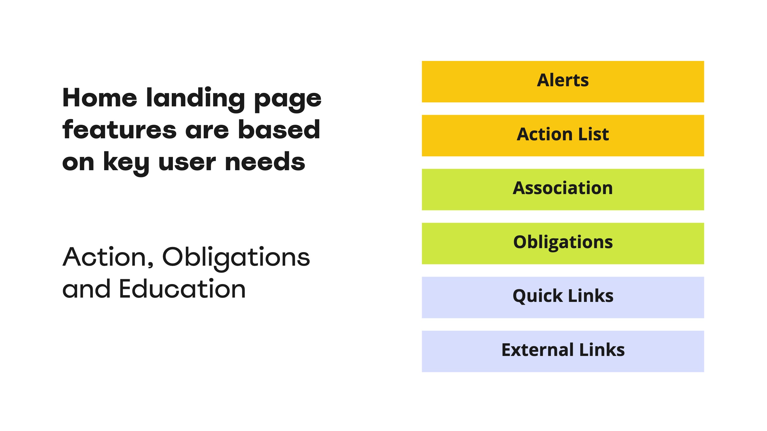
By listening to and understanding the issues made clear by the users of the funding and disclosure online portal, I was able to create a modular dashboard as a solution. The key features of the dashboard is an action list at the top, quick links and other dashboard links on the right hand side as well as external links for users at the bottom. Including these allowed us to address the need to assist users in giving them the relevant information and instructions on the tasks they need to complete. This experience will help users action disclosures and registrations without having to find and ask for information about them, saving both their time and the NSW Electoral Commission's time.
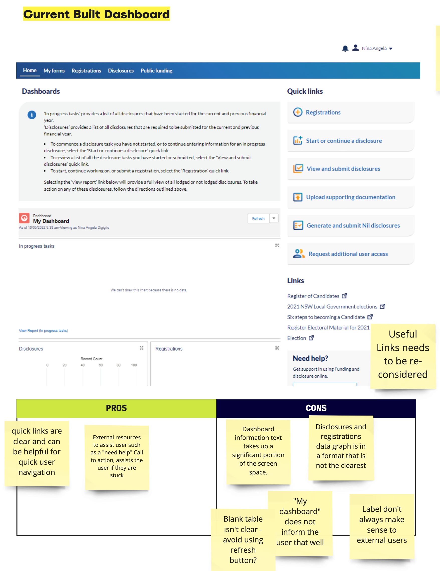
The as is Dashboard on the portal.
The portal is built in Salesforce utilising mostly custom built components. The initial dashboard lacked many features and had poor implementation impairing the users ability in actioning their tasks. In order to solve the presenting issues and create an uplift, I first looked at what was working well and opportunities for additions and improvements.
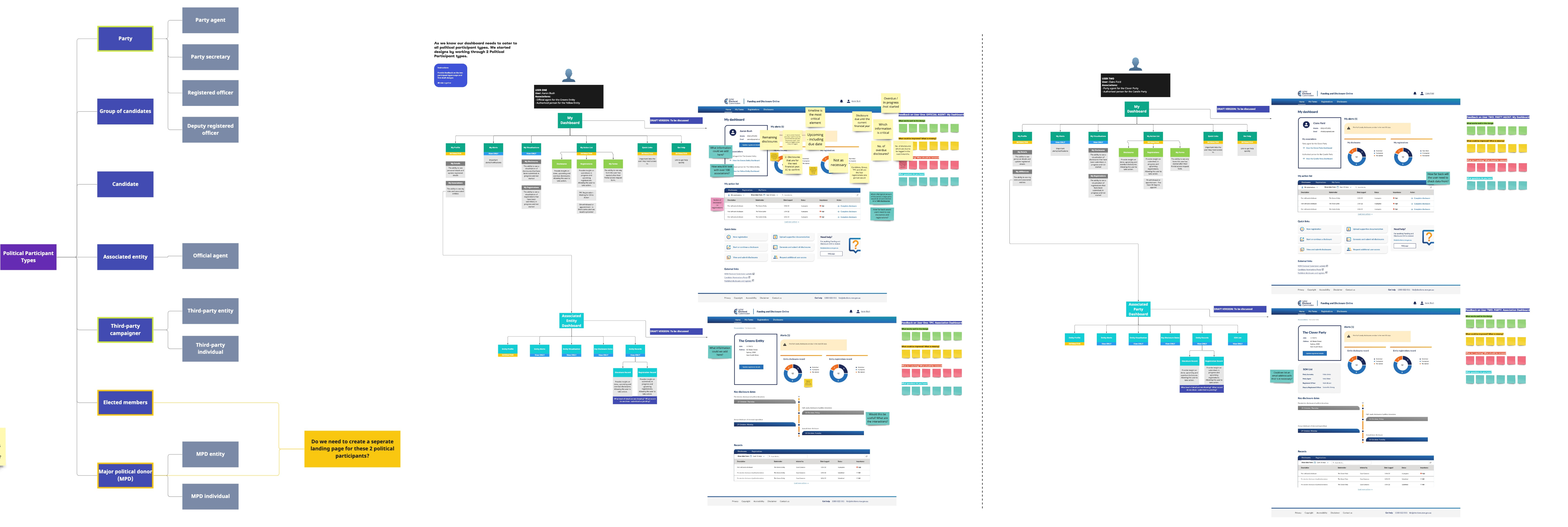
Next I ran a few stakeholder mapping sessions to examine key requirements for the users. I created quick mockups reusing components from the main website and I further researched dashboards, examining how they assist users, good examples and best practices.
After I received valuable insights and feedback, I kept iterating and setting up sessions to discuss components and the extent of interactions the user would have. These insights led me to remove the registrations graph as I discovered users would have a low amount of registrations, therefore this graph was not required. The dashboard now had several key components:
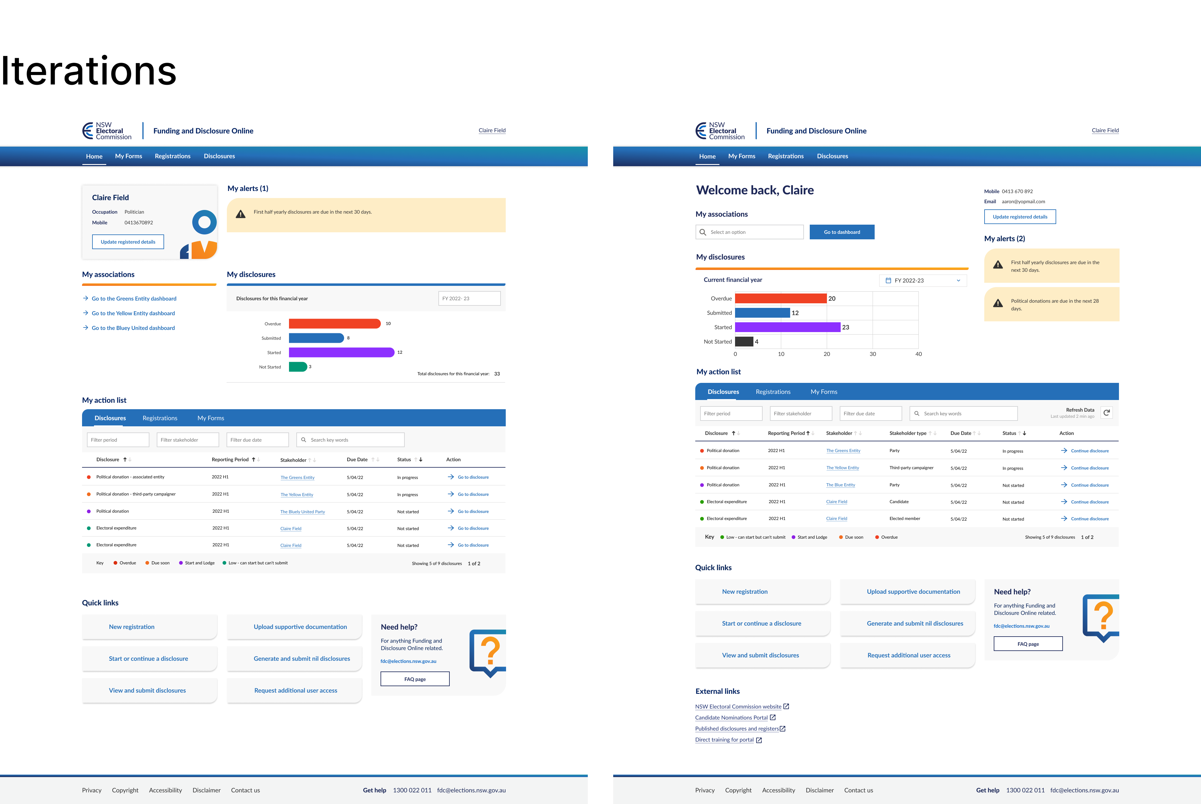
The Shift in the designs
I quickly found myself designing a dashboard to assist every persona, and thus found myself not designing for anyone. This results in significant feature creep that I believe we did not have the budget and resources to build and the dashboard becoming too complicated which could easily overwhelm users.

After reviewing the designs with the client I spoke to external design members and got some feedback on needing to rethink and take a step back.
Referring to the key design principles We already had established key design principles for the dashboard
Relevant - Dashboard should display what is relevant to me 'today' (historical information is not as important). Inform - Dashboard should inform me what my obligations and entitlements are so I can plan my work. Assist - Dashboard should be about doing (help me perform my work, not focus on what I have done). Guide - Dashboard should direct me to where I need to perform an action (e.g. clickable links).
Personas
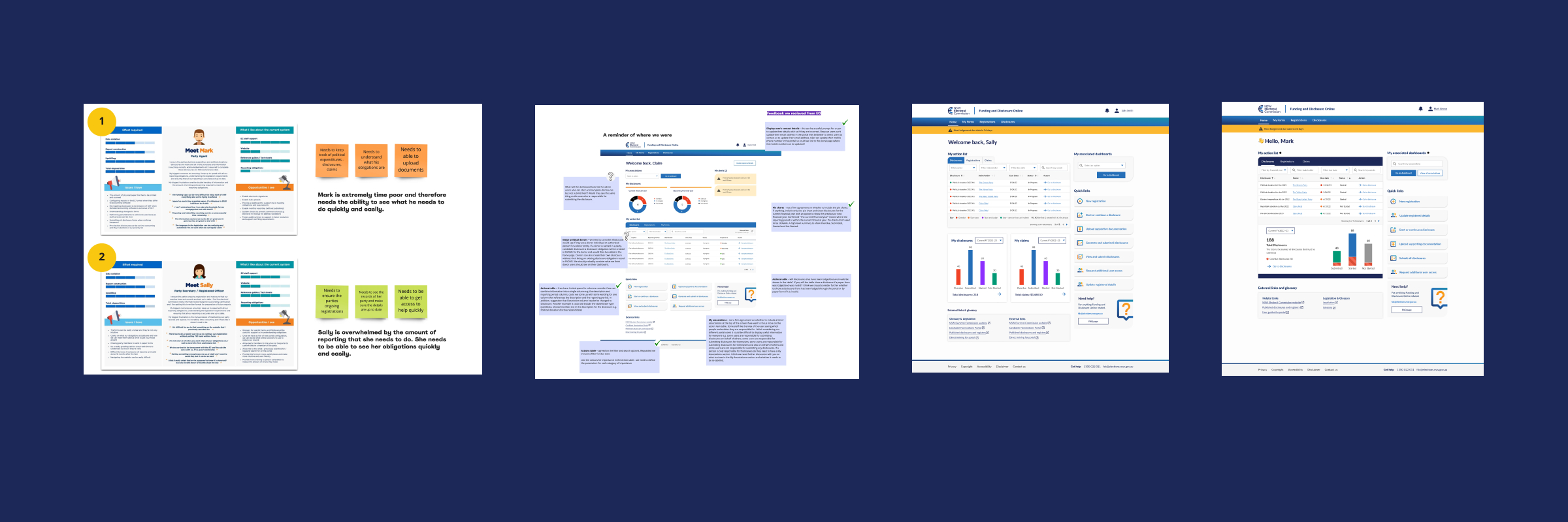
Working through this I decided to redefine and focus on 2 personas to design for. I chose a party agent and a party secretary that mainly actions disclosures and examined their needs.
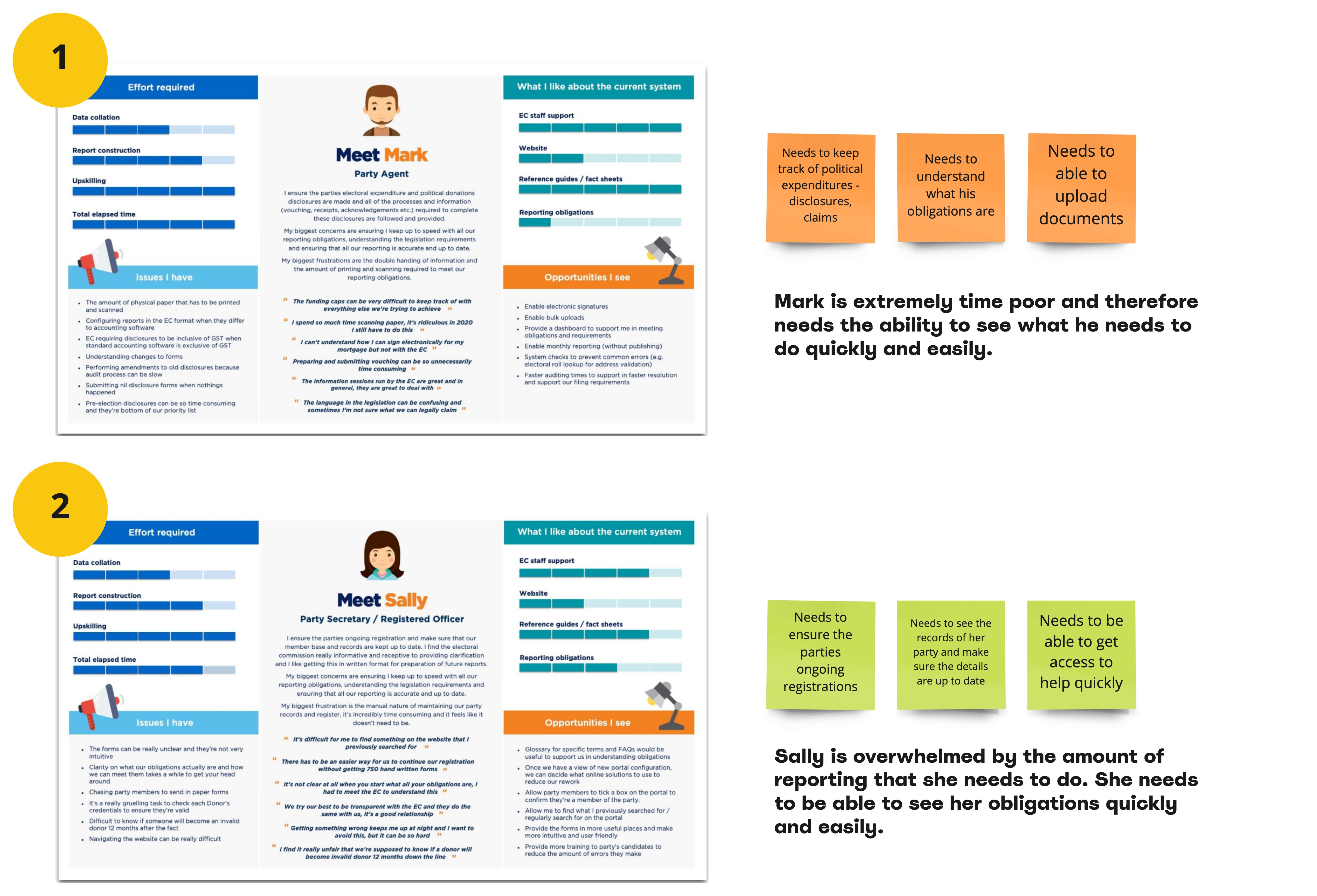
Key requirements
From the personas I worked out the key requirements of the dashboard and how the hierarchy should be laid out.
The Layout
I originally was looking at sleek portal examples that were not as relevant to this funding and disclosures portal. I leveraged government portals that were more relevant, examining what they did well and the reasons behind the thinking.
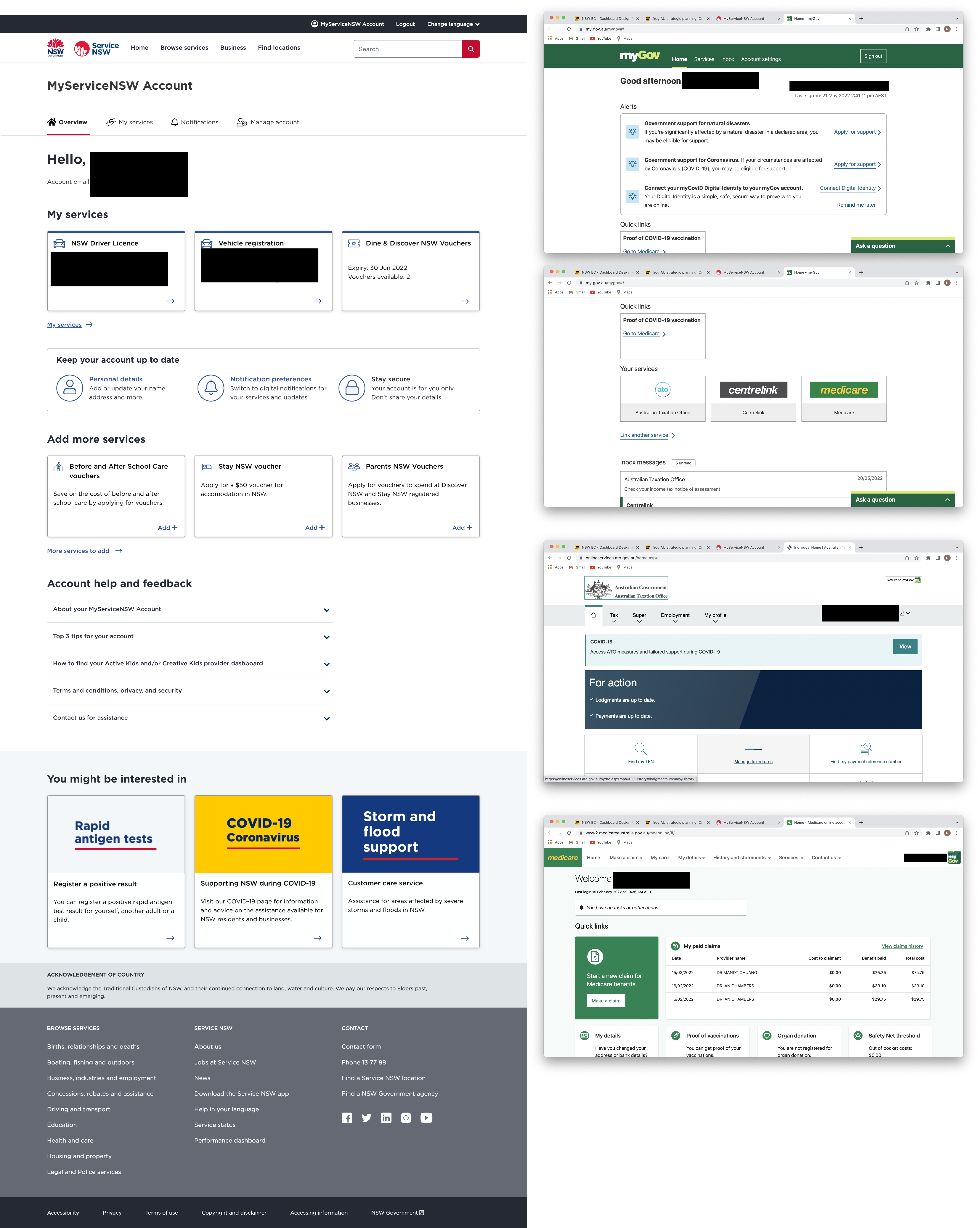
I could see what worked well:
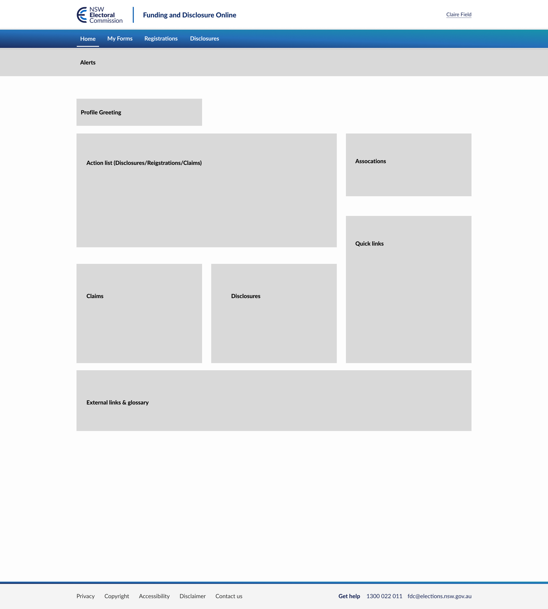
From there, I reused the components I had built to create the proposed layout in high fidelity in a new consistent style. All components were set up as cards with a drop shadow to elevate them on the page and stay consistent to the main website's design system. I removed the option to update registered details as the user can only change their phone number in most cases, and that should be able to be completed in the top header of the portal where their profile sits. I further moved the action list to the top as that is of paramount importance to this dashboard as this is where the user completes their action.
User Testing
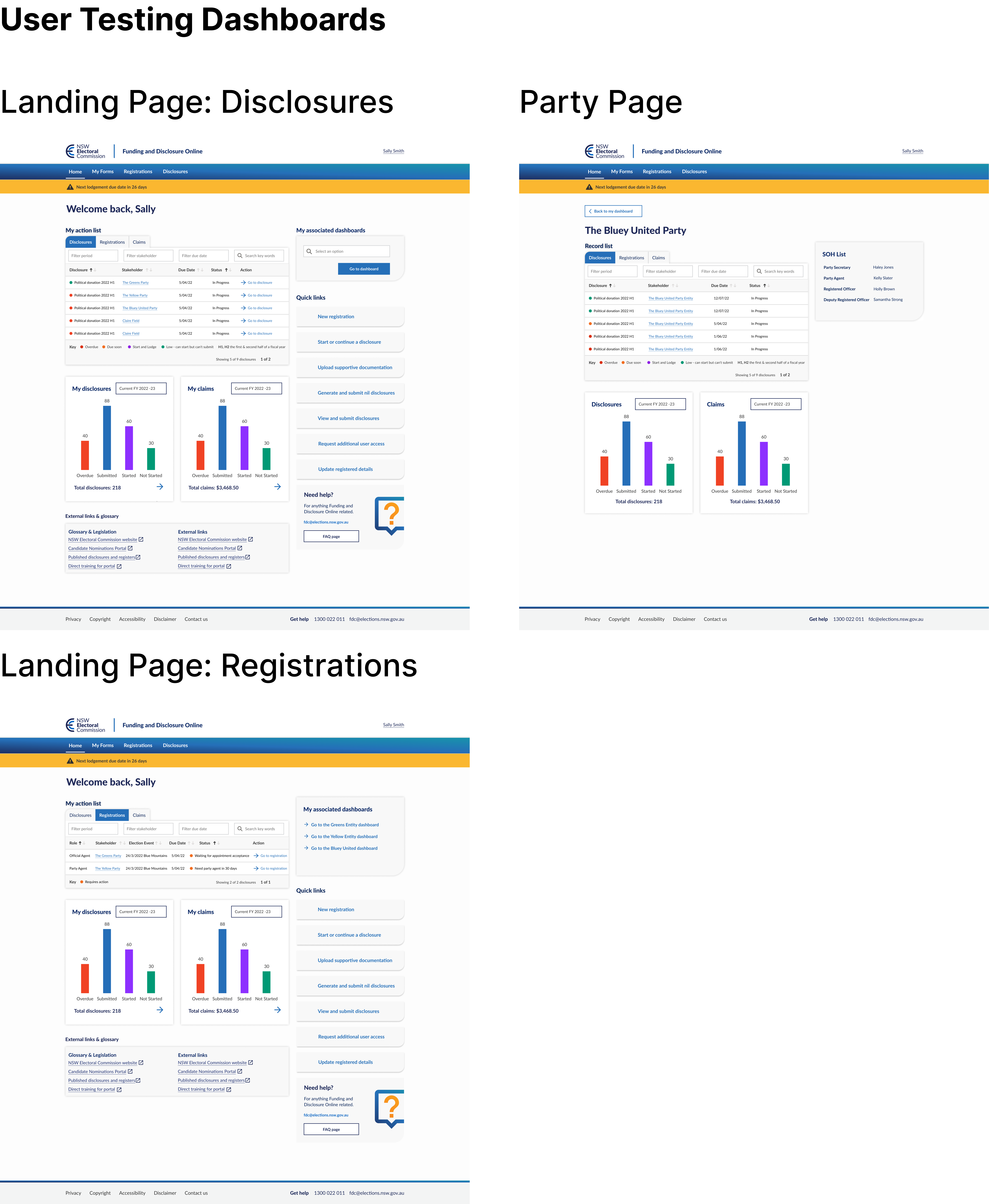
After making the new changes I conducted 30 minute user testing sessions with the help of a colleague as a scribe. This included an interview and presenting a prototype to the user with some tasks to complete.
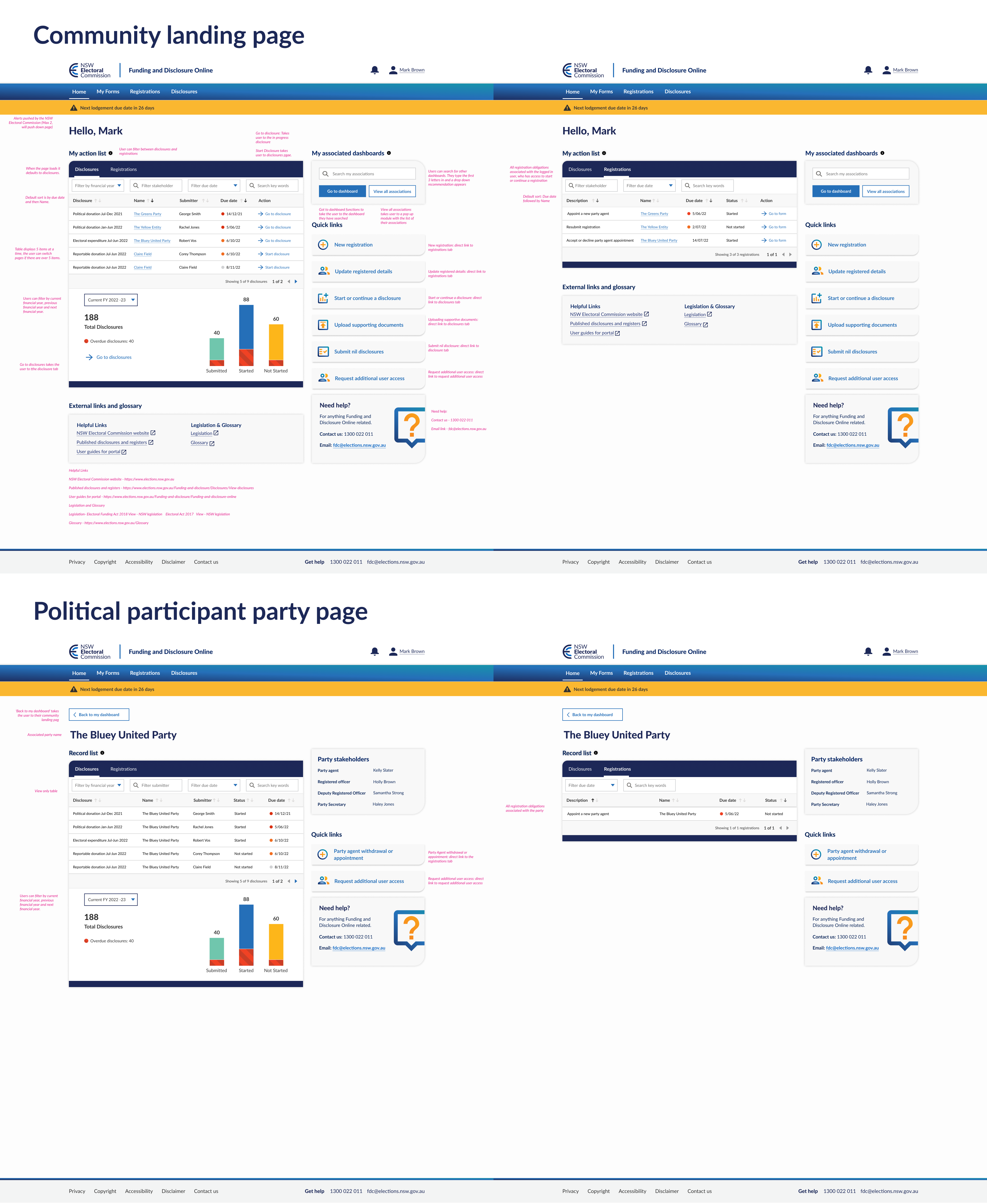
We presented the prototype which consisted of the home dashboard as well as the political participant landing party dashboard. The home dashboard had disclosure and registration actions that the user can complete, whilst the party dashboard was a view only dashboard that informed members of what disclosures and registrations had to be completed.
We prepared questions about the current dashboard, what users would like to change and how they would use a dashboard. Some examples below:
Portal and current dashboard Interview
How often do you use the portal? What do you like and dislike about the current dashboard? Is there anything preventing you from doing your day to day tasks?
Figma prototype tasks
Describe what you see and what you think would happen? How would find out what disclosures are overdue? How would you find what registrations need actioned?
User Feedback
Overall was very positive
“Wow this is a lot better than what we have, it actually makes sense.” “The graph is a nice touch to see how much I have completed.” “Looks clear and easy to read. This will save some significant time.” “I Find the table pretty useful.”
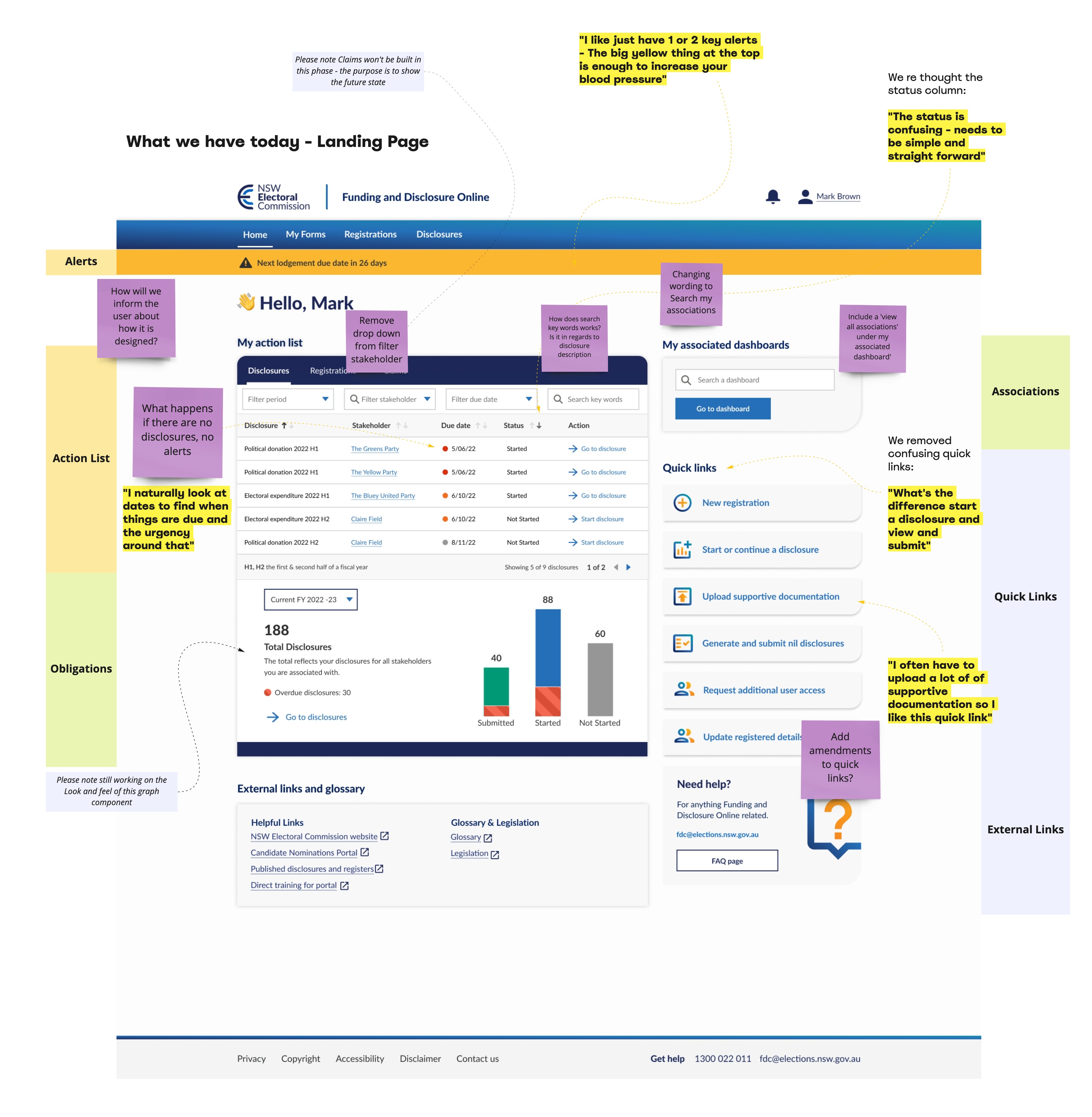
We found that users understood this layout and how to use this dashboard without trouble. There were some good insights on alerts "I like just have 1 or 2 key alerts - The big yellow thing at the top is enough to increase your blood pressure" As well as insight into chaning the status column on registrations and disclosures. "The status is confusing - needs to be simple and straightforward".
Analysed feedback and made changes
The “Claims” aspect of the design is being built in a next phase and I did not want an empty module in the dashboard design. In order to future proof the design I had to redesign “my action table” and the table now demonstrated the relevant graph attached to it. Instead of two floating card graphs of disclosures and claims below the table, it now displayed disclosures attached to the table and focused on one particular journey. Once it was built I had to clearly inform the user what the dashboard was showing, and if they wanted to see claims they would have to click the claims tab.
From user feedback I added new external links to a glossary and legislation, as users believed it would be useful as they could refer to it in case they were stuck or confused on terminology.
Feedback also showed users were confused on some terminology therefore I had to simplify the language being used. Use of language was important as this dashboard should be accessible for all residents of NSW. Some examples were “H1” & “H2”/ “first half of fiscal year and second half,” was changed to Jan-Jun & Jul-Dec and “Stakeholders” was also renamed to “Names” improving the users' understanding and experience using the dashboard.
Another challenge was that numerous users of the portal had more than one associated dashboard, and in some instances up to 12. I had originally designed a search with a drop down, but after talking to the development team this was not feasible. Instead I was able to design a pop up module that the user could see their associations and pick each one from there. We also had to rethink the status column to demonstrate the status of a particular form. This was changed from: “in progress” and “Start” to “started” and “not started”, making them easier to understand.
We found many users felt that they would ignore the alerts and it would blend together losing their impact. In response this, we made the decision to the client that we should only have 1 or 2 key alerts that were important to the user and were clear so they would not be missed.
I further removed overdue disclosures from a separate column and added it to the other three columns as it made more sense for overdue to be in context of submitted, not submitted and in progress.
Final Designs
>
Analysed feedback and made changes:
From the discussions I made a decision to add information hover icons above some components for those who are new to the dashboard/portal. This informs them of what the purpose of each module is such as the action list. This will act as a soft onboarding for new users or users that have not used the portal in a while.
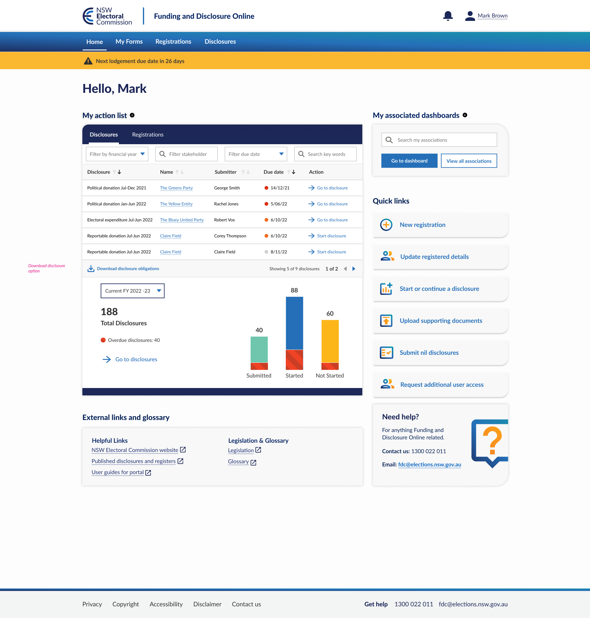
The graph below the disclosure table will display the statistics on how many disclosures the user has submitted, in progress, not started and overdue. Utilising the gamification design principle to encourage users to complete disclosures for the financial year. Further this graph provides a high level overview of their obligations thus far. In addition the user can filter the graph by current financial year, previous and future.
I created different states of the dashboard to demonstrate if the user does not have any disclosures and/or registrations.
My action list was defined as core actions that the user can complete. Therefore we would only show actionable items on the table, the user is additionally updated with status through the notification bell and email.
We explored the idea of a green tick to show the user that they have completed all their registrations and disclosures, however I decided against it as some users might have never completed a disclosure or registration and would be confused by the green tick status.
My action list was the only component card coloured differently from the brand's light grey. This was done in order to bring the users eye to their action list.
Outcome
Dashboard users praised the dashboard as they found it easy to complete actions and see their responsibilities were from a high level. Client was ecstatic with the final result and we won the next set of work to keep developing the portal in the following year.
I designed a download for disclosure obligations, if the user clicks on this call to action, they will receive a pdf of all obligations/actions the user has to do. This will save the NSW EC time as currently users request their obligations to the NSW EC, and the staff have to manually email the obligations to the user. This feature was outside the scope of the 2 sprints and will be built in future. As there are some issues around privacy and the amount of work required on the back end to generate those pdfs that need to be considered.
Reflection and Learnings
Figma auto layouts were paramount in the designs. I was constantly changing table data which was tedious and time consuming. This is due to the nature of rebuilding the actions table since we kept changing what data within the table. Auto layouts made it easier to switch components in and out, reducing and expanding the table and making spacing a breeze.
When designing a dashboard, government dashboards are good to reference. Government dashboards in general have a significant amount of funding and research to make the best viable product to service millions, in this case the Australian government portals. They often have best practices and accessibility embedded all through the design, and are a useful reference.
